– by a New Deal Democrat
Record job growth in April defies the Fed’s efforts
There is no economic news this morning, so let’s take a closer look at some important trends from last Friday’s April jobs report.
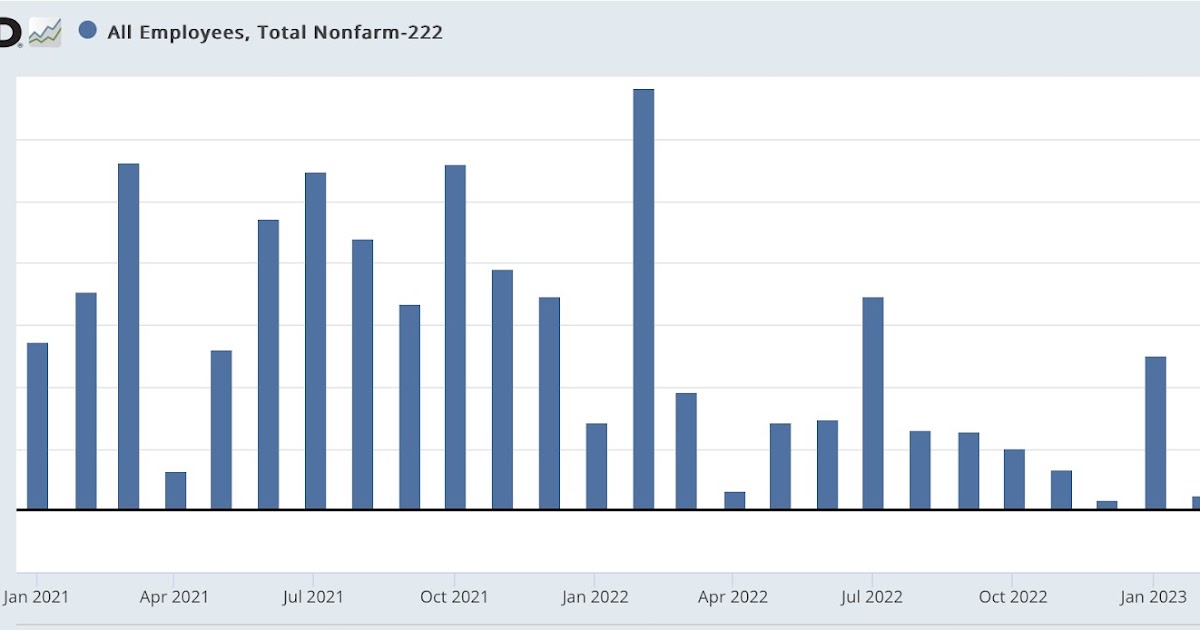
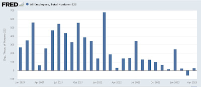
As I and many others have written, an important theme has been that the slowdown in job growth continues, as shown in this chart from January 2021 (note that 222,000 has been subtracted so that the latest average is at zero ):
An average of 222,000 jobs were created over the past 3 months, the lowest level since the pandemic recovery began in 2020.
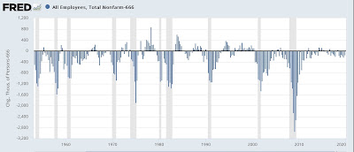
But on an absolute scale, over the last 40 years, an average of 222,000 jobs per month over a 3-month period is better than about 80% of all quarters (the chart subtracts 222,000*3, so the quarterly average equivalent to the last 3 months, shows zero):
So, on an absolute scale, all that’s happened is that hot job growth in 2021, which slowed to hot job growth in the first half of 2022, has now cooled to just growth of hot jobs.
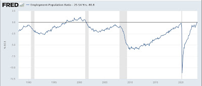
All of this has resulted in the highest prime-age employment-to-population ratio since the tech boom of the 1990s (the current level of 80.8% is subtracted to show zero):
And I won’t even bother to show the current unemployment rate, which is equivalent to the lowest level in almost 70 years.
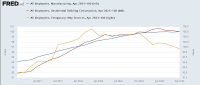
As I also pointed out on Friday, there was some mixed data among the leading employment sectors: Temporary (gold) and housing (red) both fell, but manufacturing (blue) rose to a new post-pandemic high:
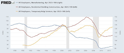
If all three have or are in the process of reversing, over the past 30+ years, which has typically occurred many months before the actual onset of subsequent recessions:
Why is employment holding up so well amid declines in so many other indicators — not just leading indicators, but things like industrial production or real retail sales?
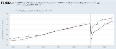
I believe this has to do with employment still having a ways to go to ‘catch up’ to the huge increase in total consumption, including consumption of services, in real terms. Here’s what real consumption and employment growth looks like since the end of the Great Recession. Since consumption of goods (but not services) typically grows faster than employment, I’ve normalized the consumption trend line to best show the comparison during the last expansion:

